Quizzes
Quizzes
Welcome to the “Quizzes” documentation.
Looking to integrate a quizze into your website? Our widget allow you to create a fun and engaging experience for your visitors.
In this guide, we'll show you how to use the editor to customize your quizze widget.
Step 1: Open the Editor
1. Go to Quizzes template.
2. Click on "Edit" after choosing your template.

Step 2: add and customize questions
In this panel, you can easily add, remove, clone ,or edit questions as needed.
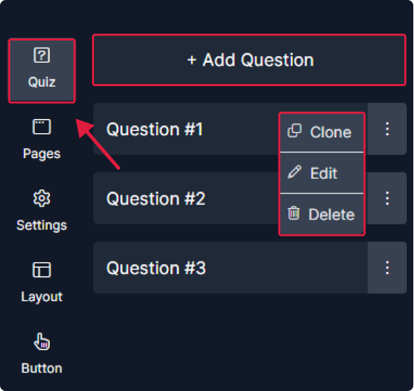
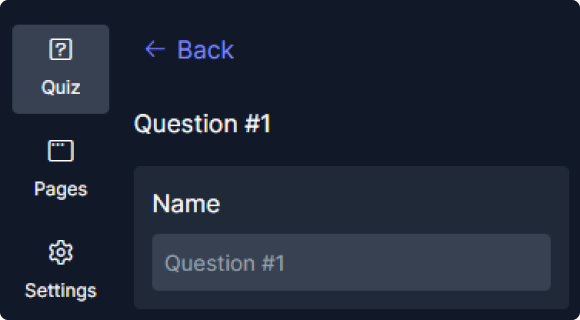
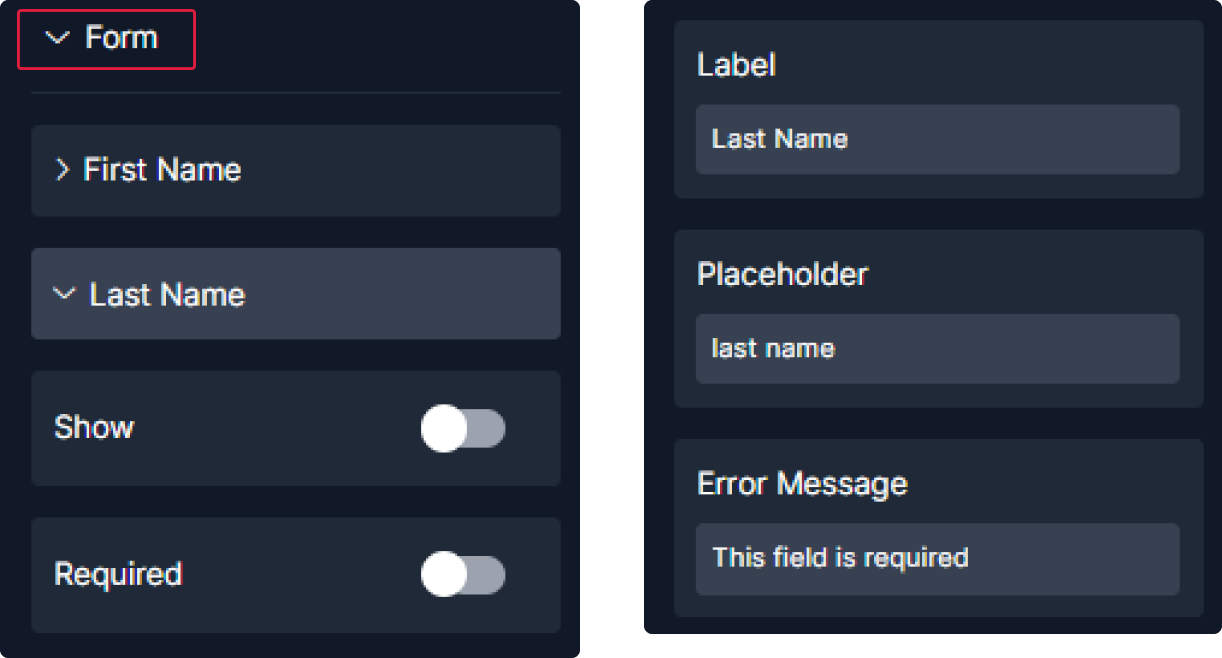
1. Customize each question by adding its name.
2. To add conditions, provide a name and choose its activation status. Then, determine when it should be hidden and specify its state.
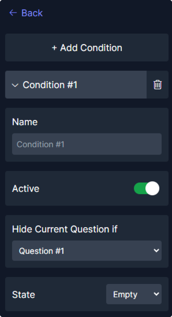
The conditions are not included in the first question.
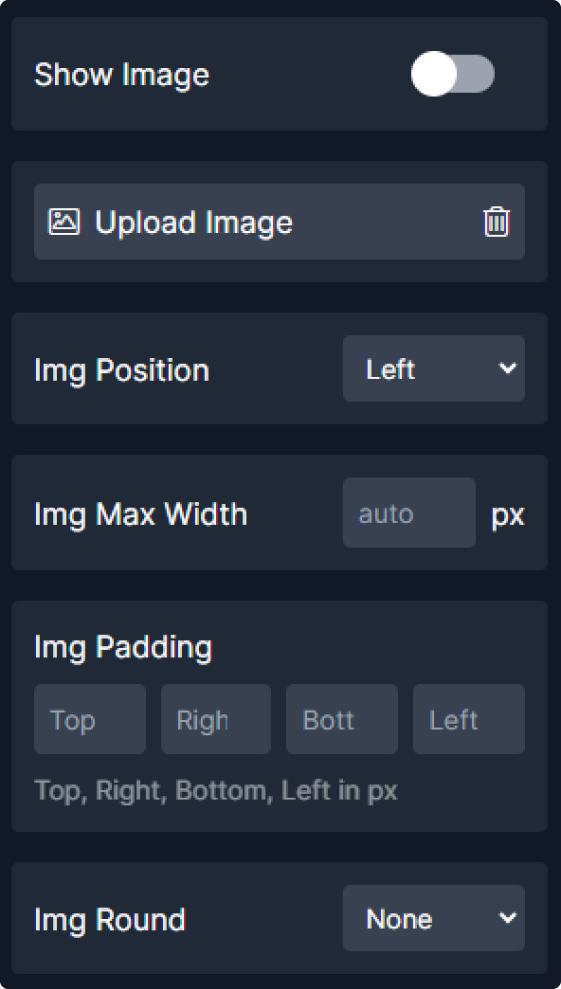
3. Proceed to add your options by providing a label and uploading an image for each.

4. In settings, select the question type: "Checkbox" or "Radio."

5. Now let's adjust the layout:


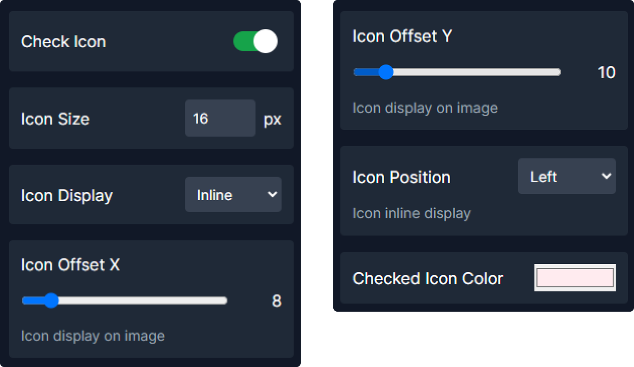
6. Moving to the options preview where you will:


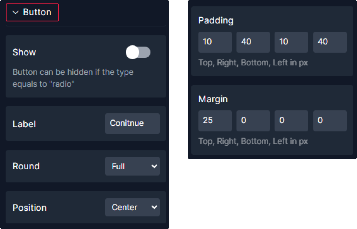
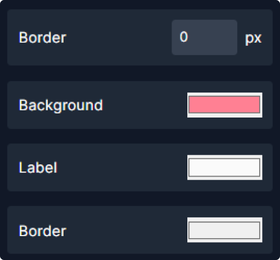
7. For the button:
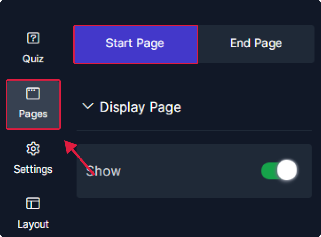
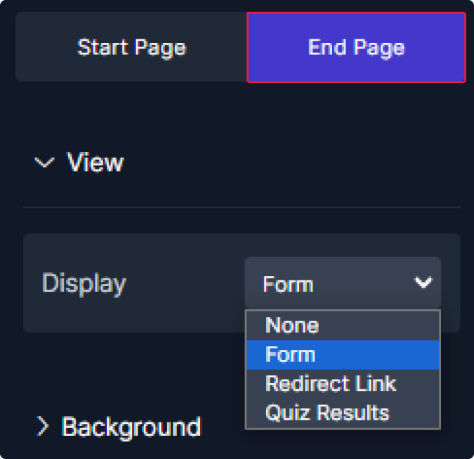
Step 3: Edit Pages
1. Let's begin by the "Start Page" :

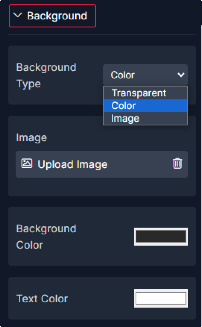
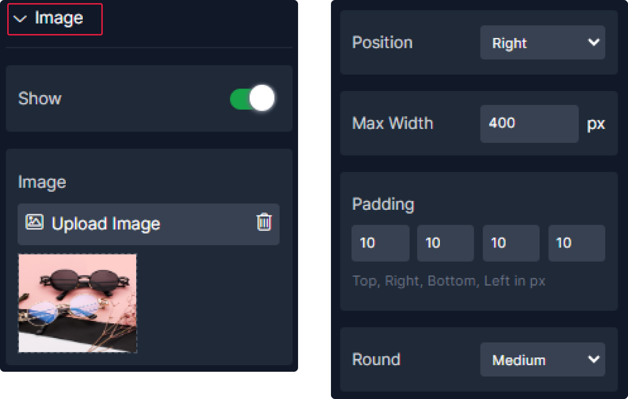
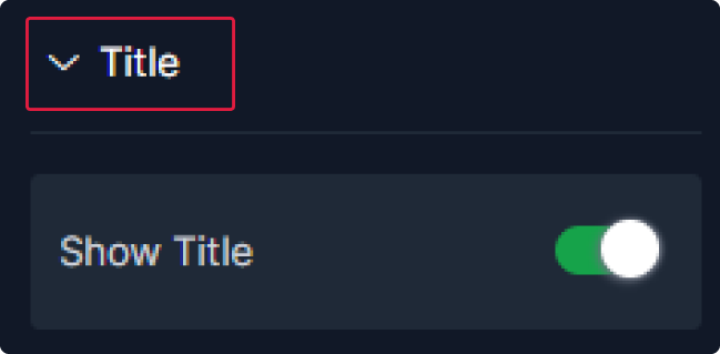
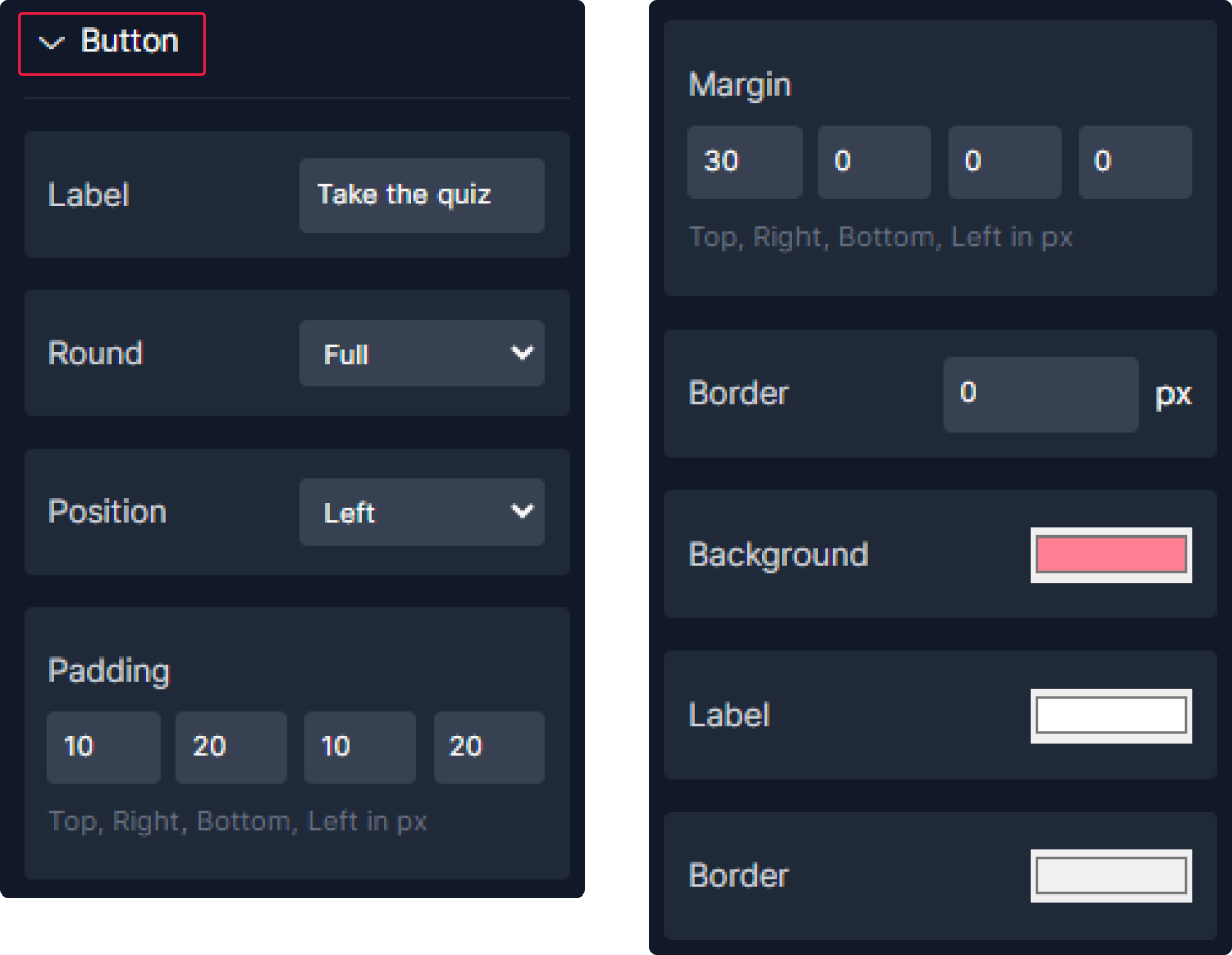
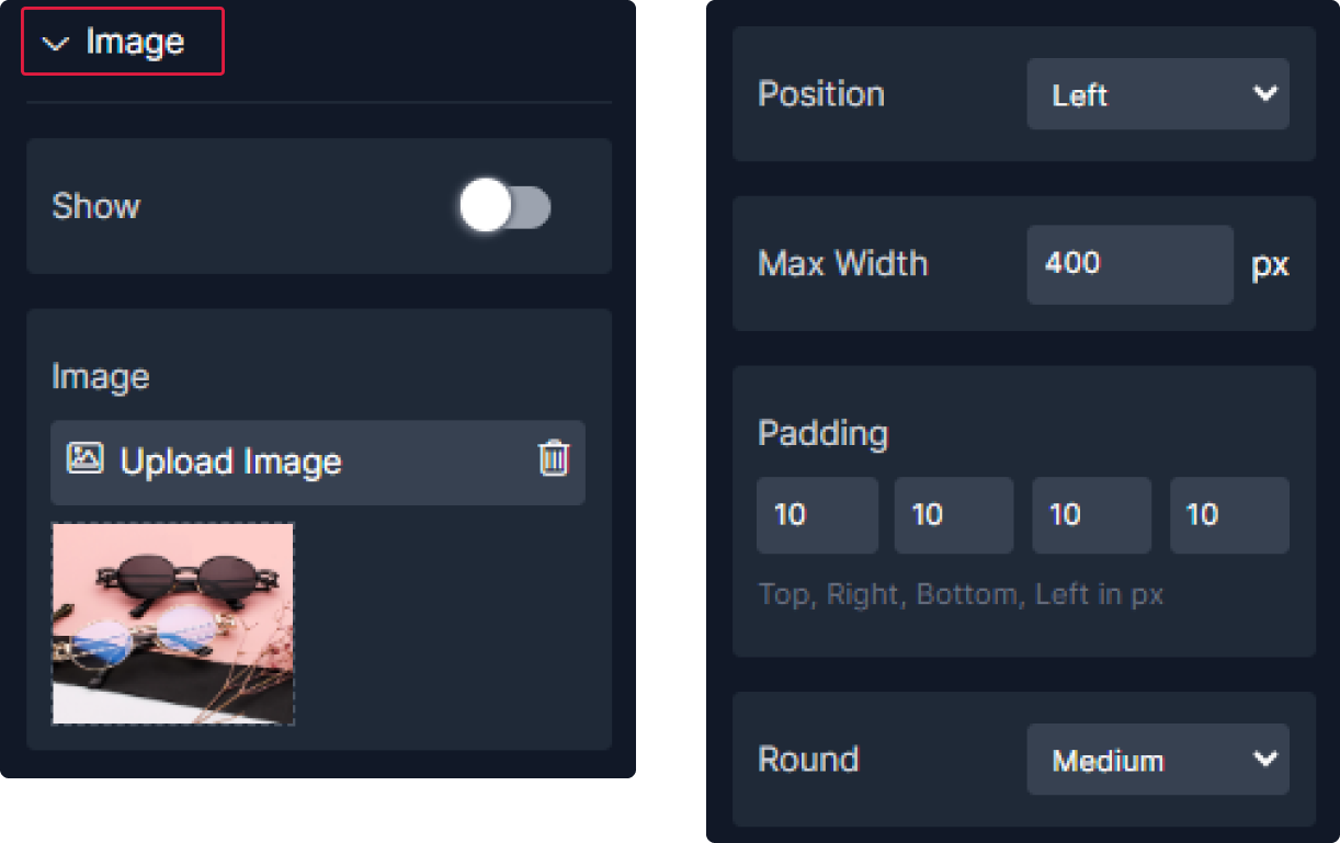
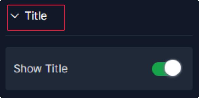
2. For the "End Page" :


Step 4: Configure settings
In this Quizzes settings panel, you have control over various aspects:
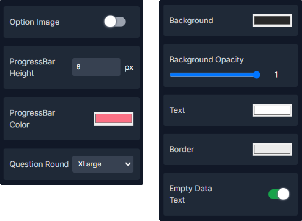
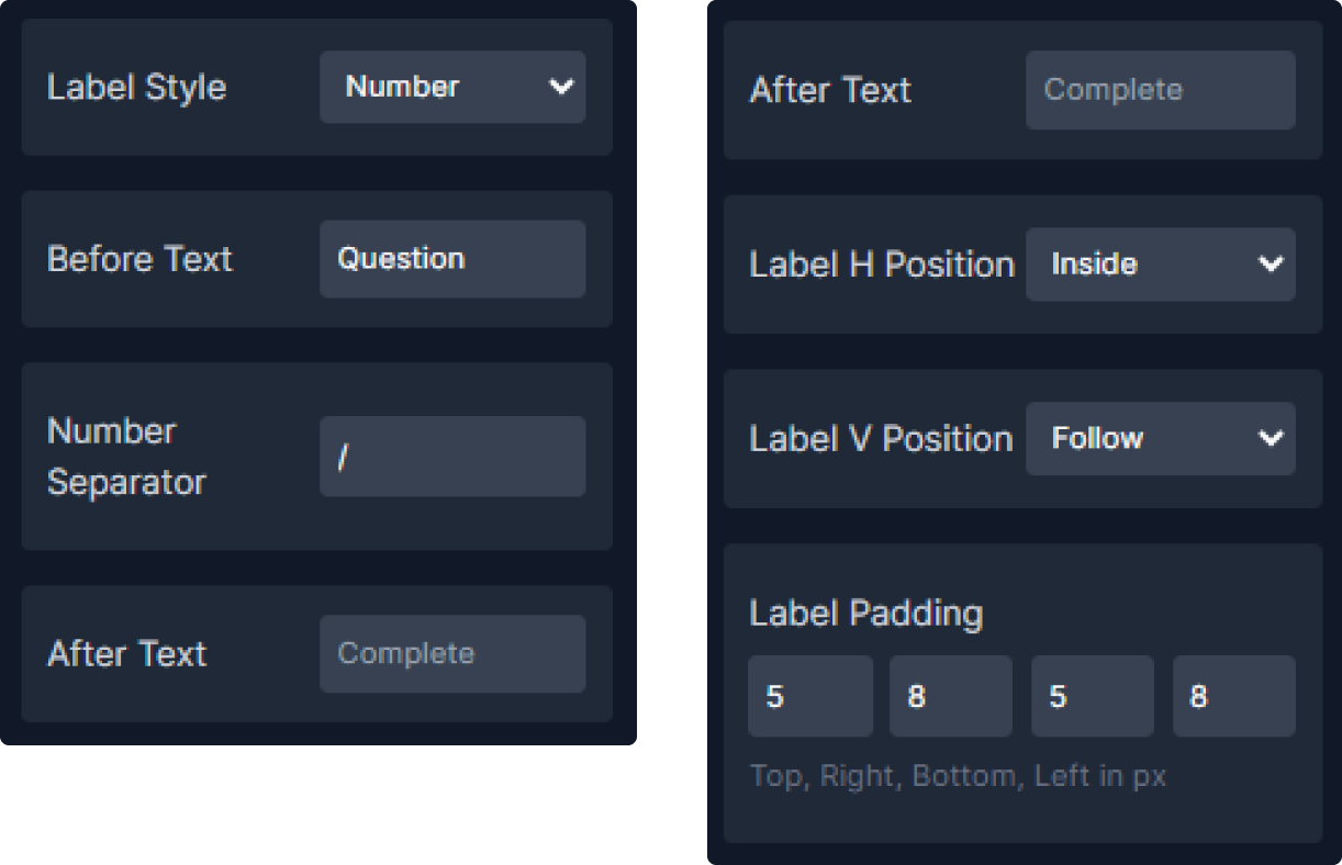
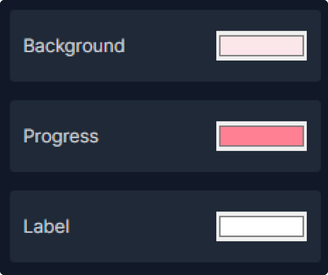
1. To display the progress bar, click on the "Show" toggle, then customize its position, padding, height, and roundness.

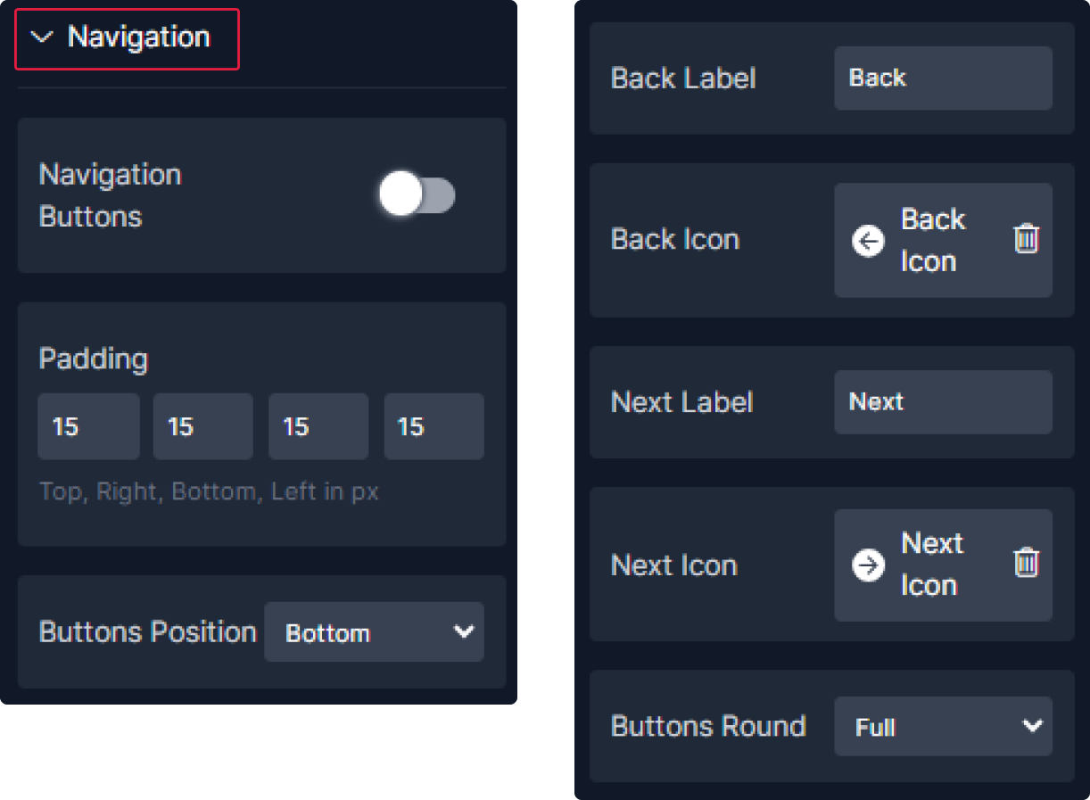
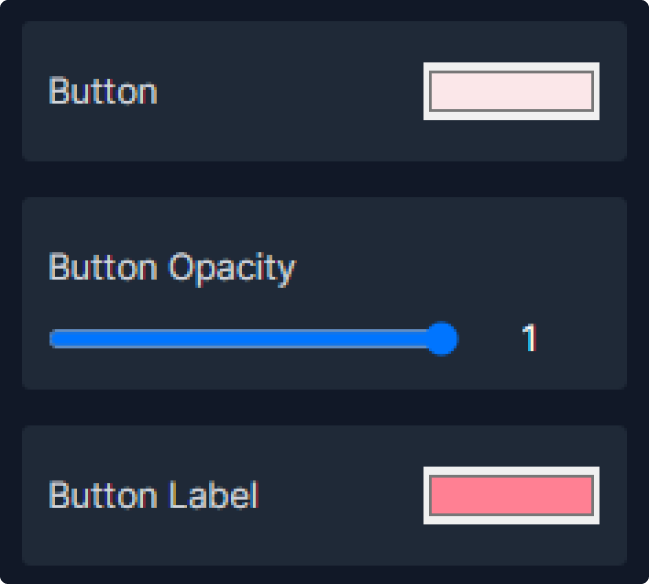
2. Configure the navigation settings by clicking on the "Navigation" toggle to show it. Then customize padding, button positions, roundness, as well as the icons for back and next labels.
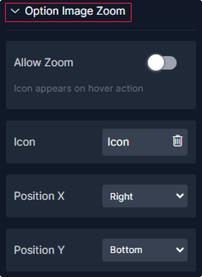
3. To enable the image zoom feature, click on the toggle, choose its icon, and specify its position along both the horizontal (x) and vertical (y) axes.
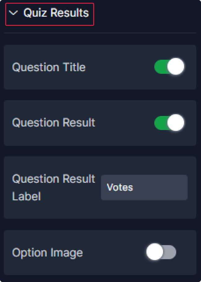
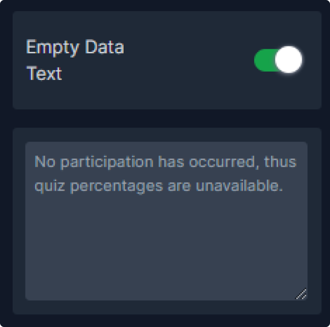
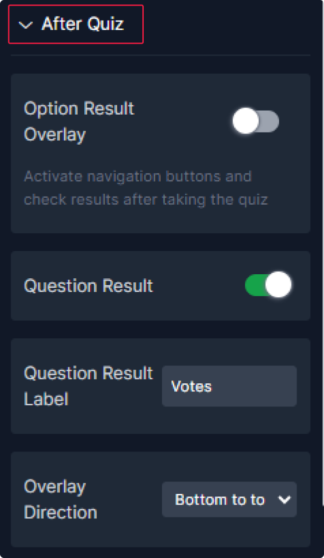
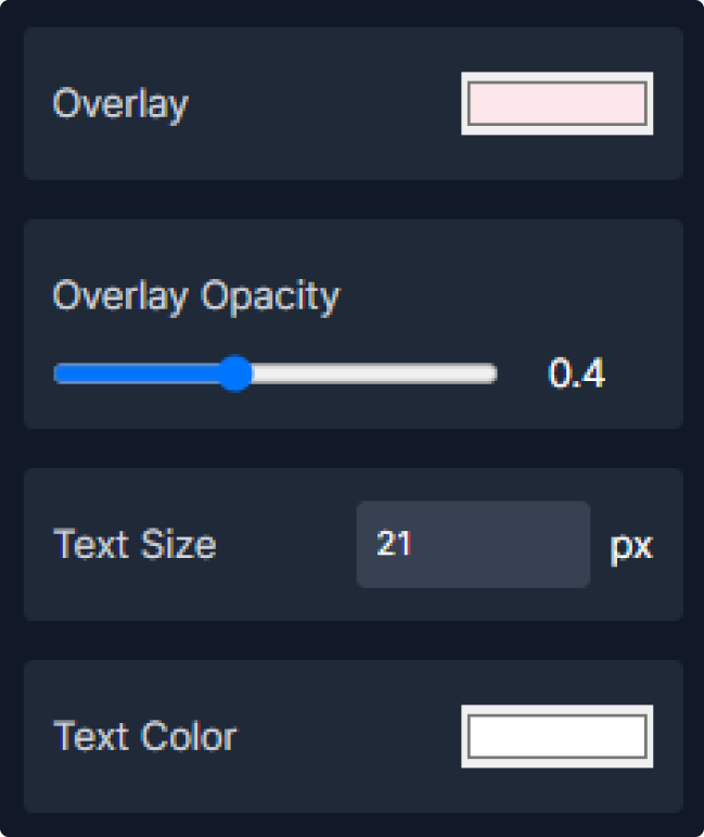
4. Set the After quiz by show the option result overlay and question result. add the label for the question result and select the overlay direction.
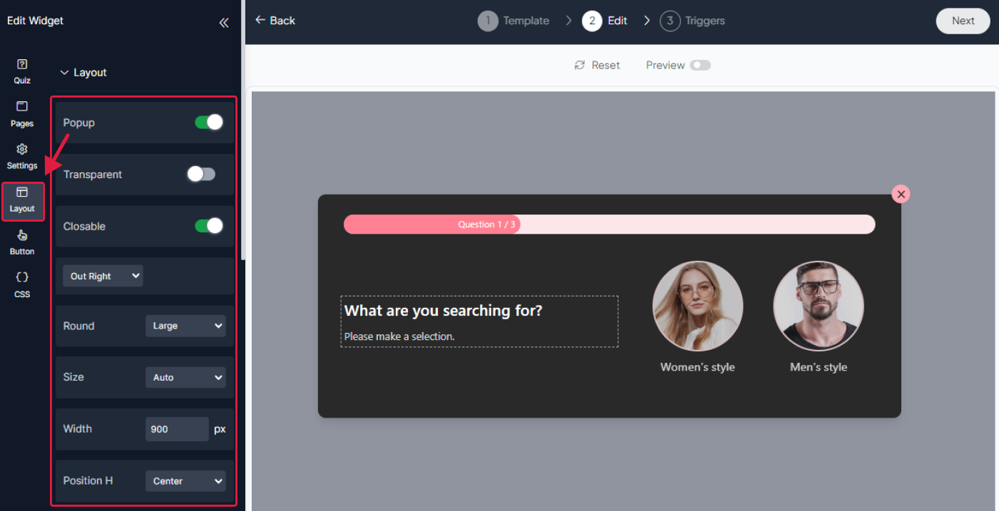
Step 5: Adjust The layout
In the Layout panel, you can adjust how your layout looks and behaves. You have control over things like size, rounding, width, popup position, adding an overlay, choosing how it's displayed, and even adding animations.


Step 6: Personalize The Button
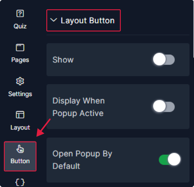
1. In the layout button section, You can choose to show or hide the button, display it when popup active and open the popup by default or no.
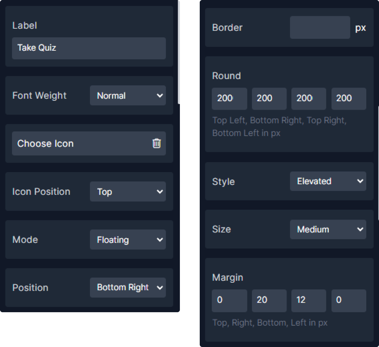
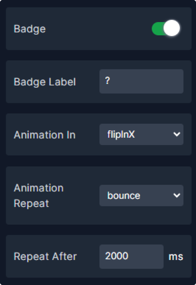
2. Now let's Customize the button by choosing its background style and edit its text and border colors.

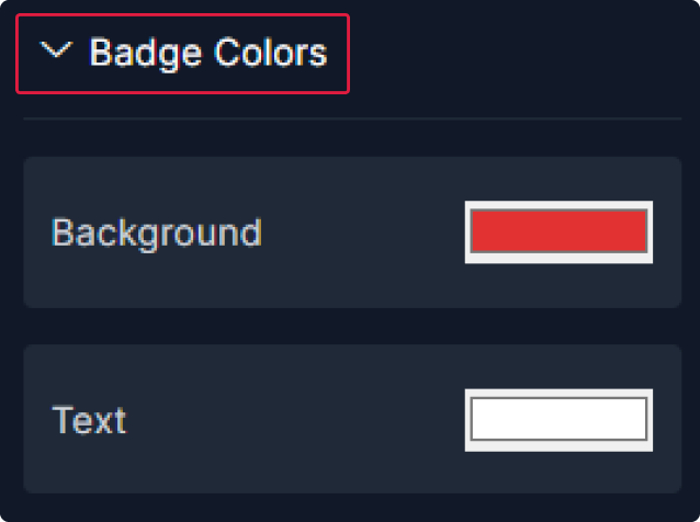
3. Finally, edit the badge background and text colors.
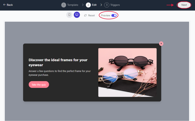
Step 7: Preview
Lastly, you can click on “Preview” to see how your popup or section shop looks on both desktop and mobile devices. After this, you can proceed to the next step.
Related Articles:
widgets
social feed
social
all in one reviews
wheel of fortune
editable reviews
restaurant menu
notification feed
youtube gallery
instagram feed
Enquiry Form
popup shop
countdown
image slider
Cookies
Buttons
Rss feed
More widgets
integrations
webhook
hubspot
mailchimp
convertkit
slack
sendgrid
More Integrations
installations
shopify
wordpress
squarespace
webflow
duda
jimdo
More Installations
built using fouita!